


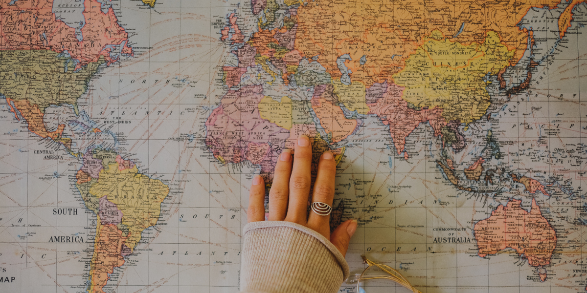
Most of us grew up looking at a rectangular map of the world yet what if we told you that the world map you’ve seen your whole life is completely wrong?
The most commonly used world map, the Mercator Projection, was created in 1569 and was never intended for accurate geography. Instead, it was designed to aid sea navigation. While useful for sailors, it severely distorts the sizes of continents. For example, Greenland looks almost the same size as Africa, when Africa is actually 14 times larger.
This distortion doesn't just misrepresent geography it subtly influences how we perceive global power, wealth, and importance. Countries in the Global North appear larger and more dominant, while nations near the equator look smaller and less significant.
Newer projections like the Gall-Peters and globe models offer a more accurate representation, but they’re still not widely used in classrooms.
In reality, the only truly accurate map is a globe. So the next time you look at a world map, question what you’re really seeing.


